Previous
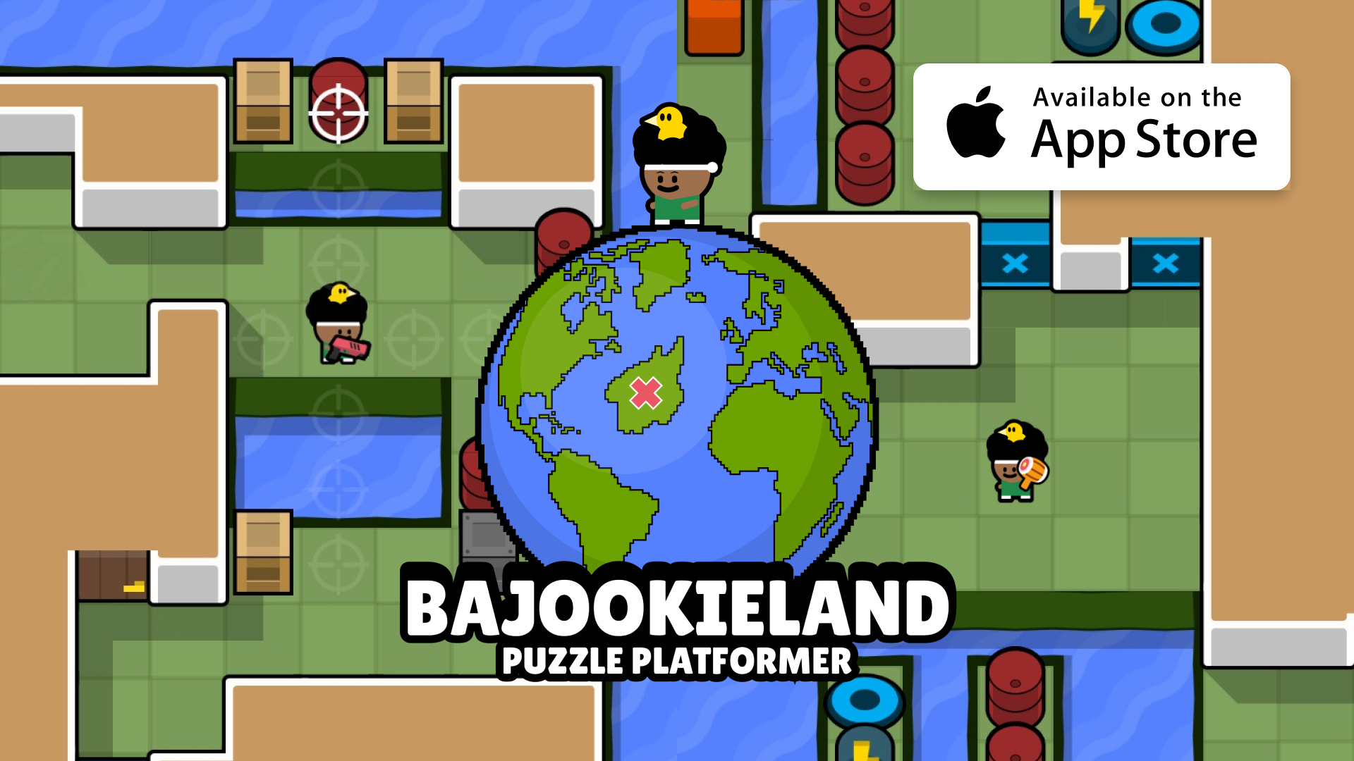
Bajookieland Game
iOS game developed in Unity
Next
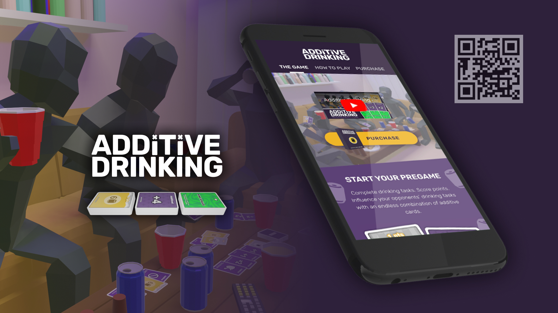
Additive Drinking
Card game, e-commerce site, and Kickstarter
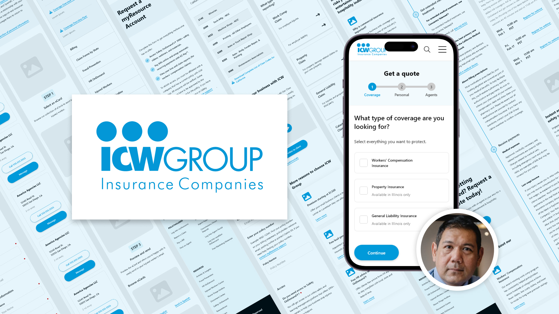
Website Redesign: A Full UX Lifecycle Project
Visit the website:
icwgroup.com
My Tasks
Architecture Design
Designed the navigation, information architecture, sitemaps, flowcharts, and user journeys
Wireframing
Designed interactive prototypes in Adobe XD for 100+ pages
Collaboration
Lead discussions with cross-functional teams to communicate design concepts, gather feedback, and handoff materials
Usability Testing
Conducted sessions with customers to collect feedback, identify user pain points, and enhance the user experience
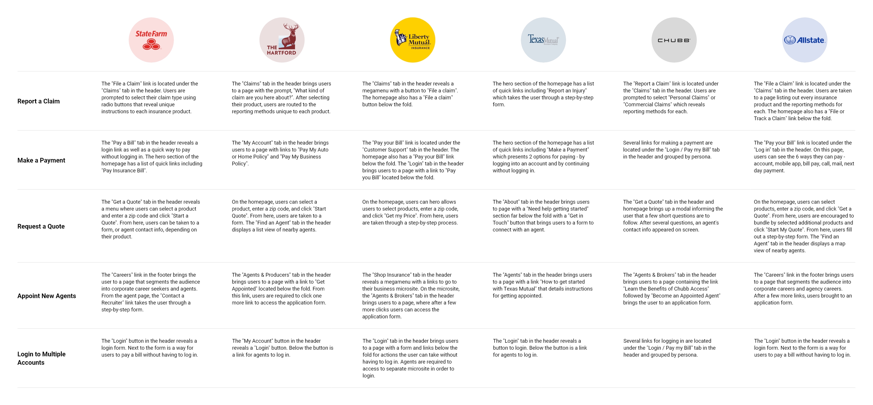
Competitive Analysis
Competitor websites gave us an understanding of the insurance landscape, industry trends, and best user experiences for creating our own design.
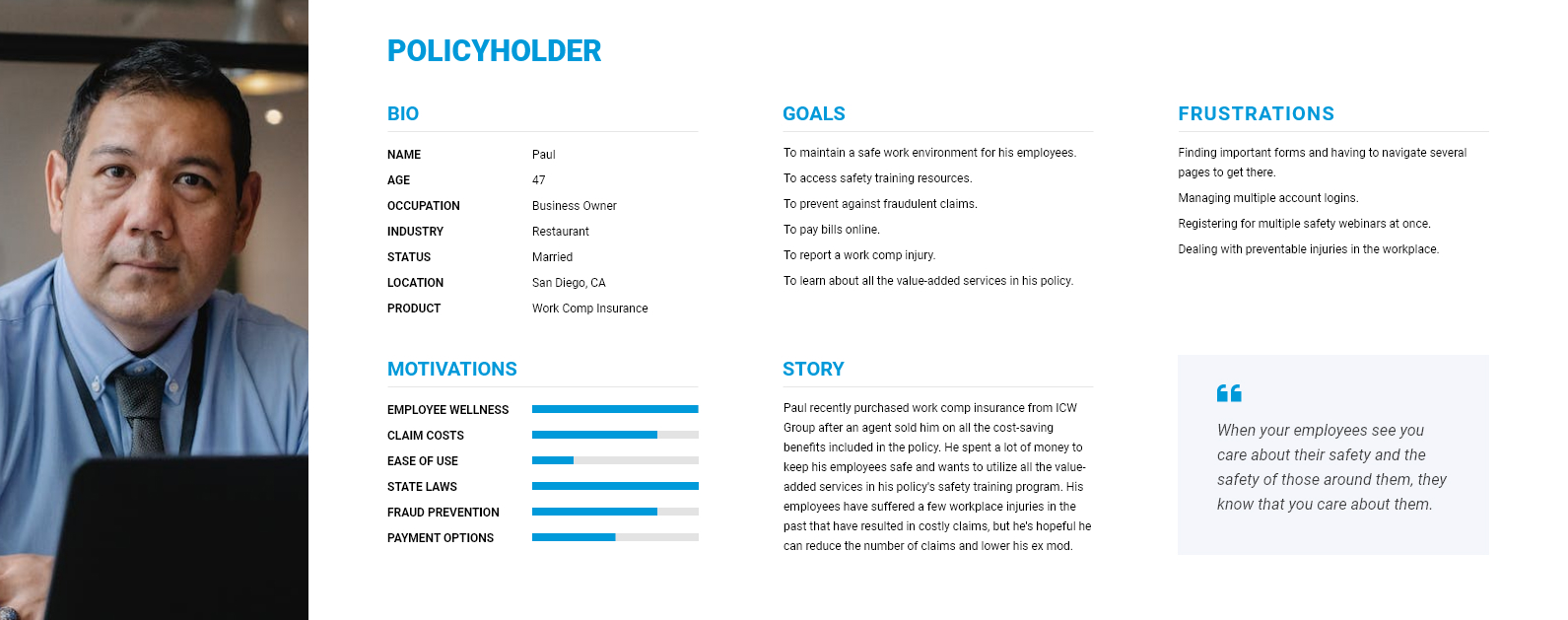
Persona
Our primary persona is Paul, a policyholder covered with our workers' compensation insurance who typifies the majority of our audience. His profile is filled in below with information we gathered from our research to help guide our design decisions.
Information Architecture
The sitemap represents the structure of the 100+ web pages included in the new website. Content was organized in a way to enhance the user experience of our primary persona while providing a grouping of content for our secondary persona.
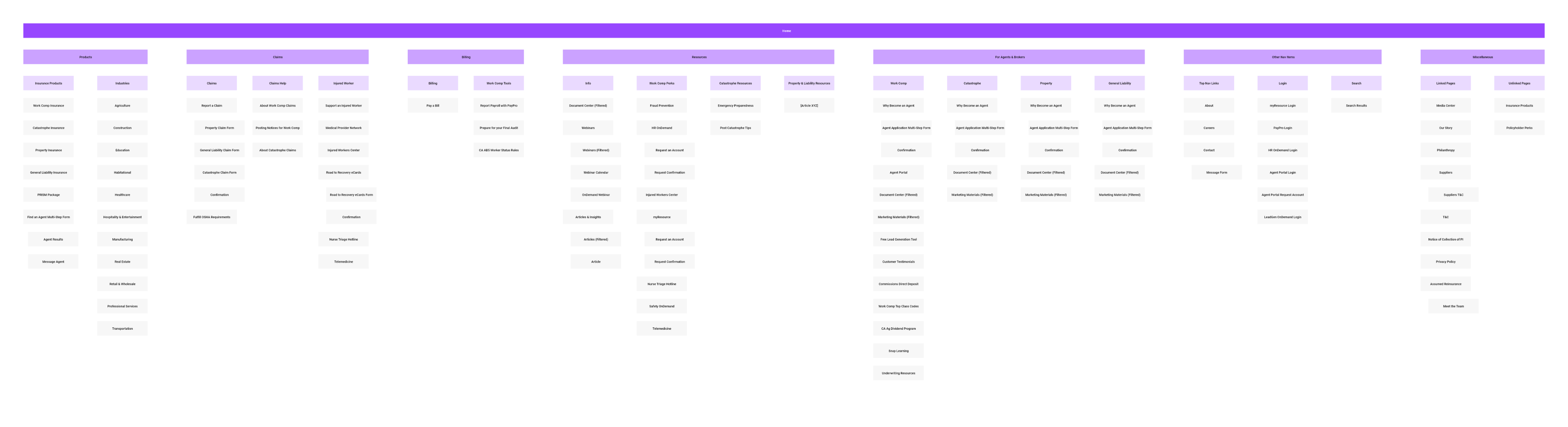
Problem
It was a challenge designing the website to accommodate 4 new user groups which we originally thought had their own unique workflows for tasks like paying a bill, reporting a claim, getting a quote, and getting appointed.
Solution
Creating the sitemap fueled productive discussions with managers and stakeholders that provided clarity about when and where a unique workflow was needed and helped bring cohesiveness to the siloed departments in our company, resulting in simpler user journeys.
Navigation Design
The header gives access to the major tasks our the primary persona. The callout "For Agents & Brokers" provides a space for our secondary persona to consolidate the many links that could otherwise clutter the navigation for our main audience.
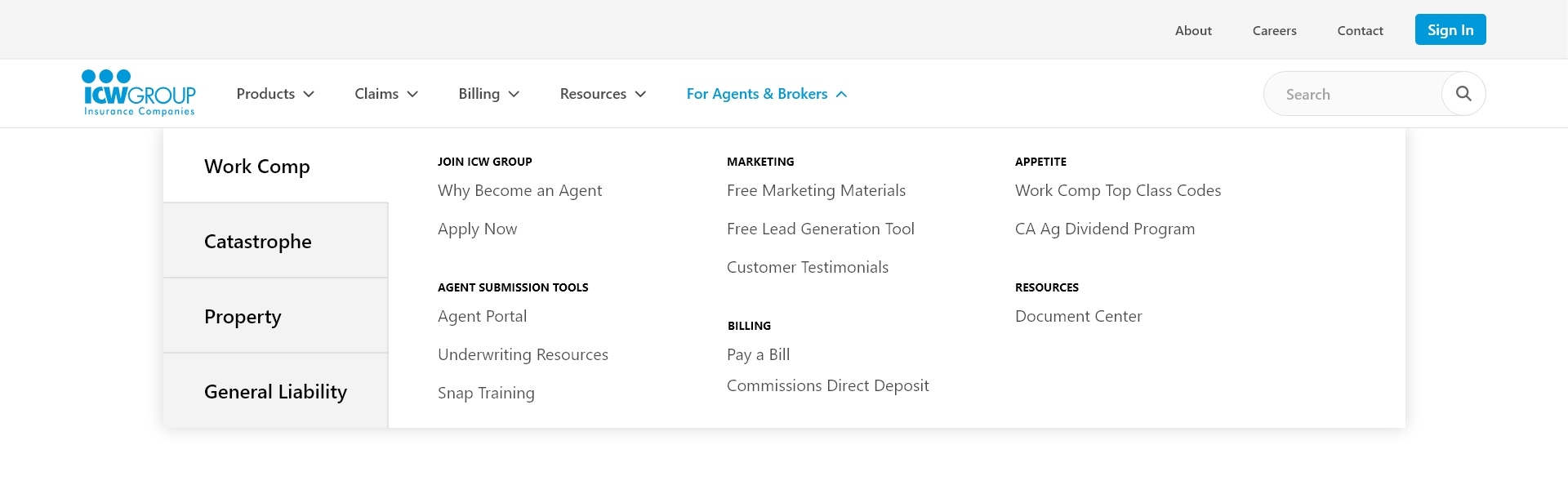
Problem
It was a challenge creating links for additional content like Careers, About, and Contact which didn't fit under the header links.
Solution
I designed a second, smaller header in the top-right corner, referred to as the "eyelash", to place these less frequently accessed pages and minimize clutter for primary audiences.
Collaborating with Team Members
We used the Wrike project management application to coordinate deliverables in our team. I collaborated with the following team members below:
Stakeholders
I provided stakeholders with sketches, wireframes, and flowcharts
Copywriters
I provided copywriters with wireframes in PDF format and received copy in annotations
Graphic Designers
I provided designers with wireframes in Adobe XD and received mockups in PDF
Developers
I provided developers with functionality documentation and wireframes in Adobe XD and received the final finished website
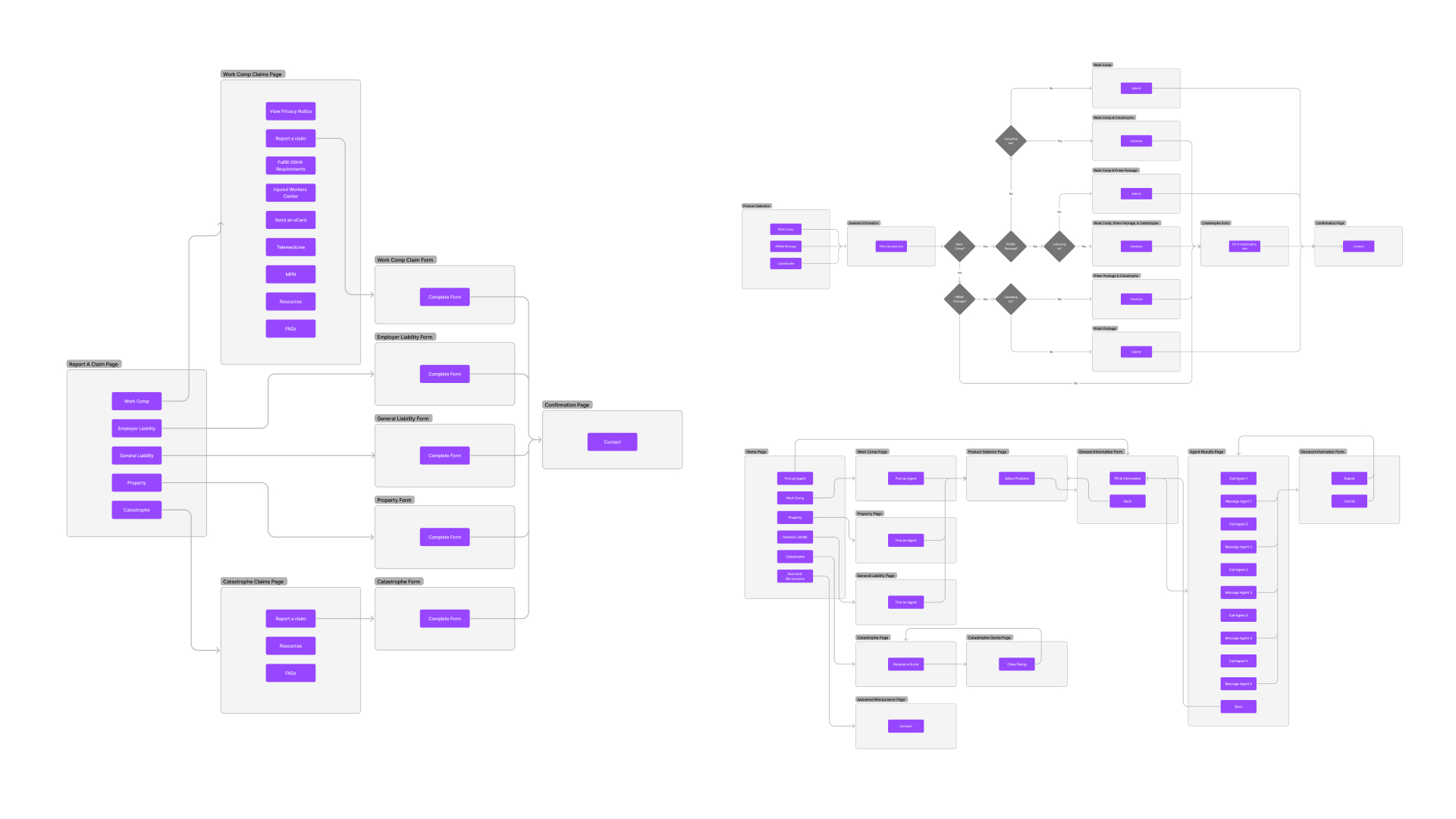
Flowcharts
Flowcharts helped facilitate productive discussions with stakeholders and become useful for explaining to developers how pages are linked.
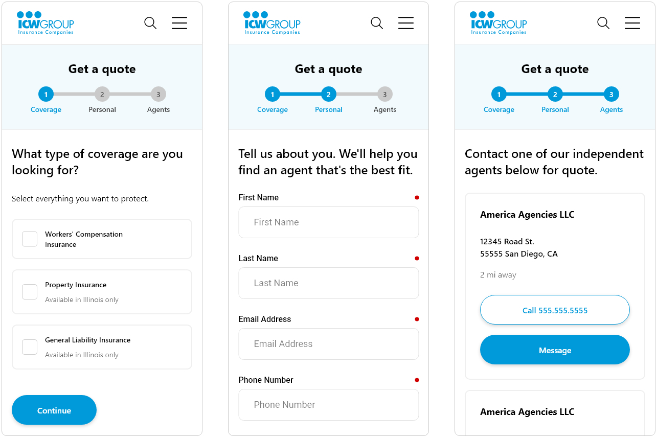
Form Design
A multi-step form walks the user through the journey of onboarding users within their company in a way that breaks a complex flow into smaller, manageable pieces that does not overwhelm the user, and reduces site abandonment.
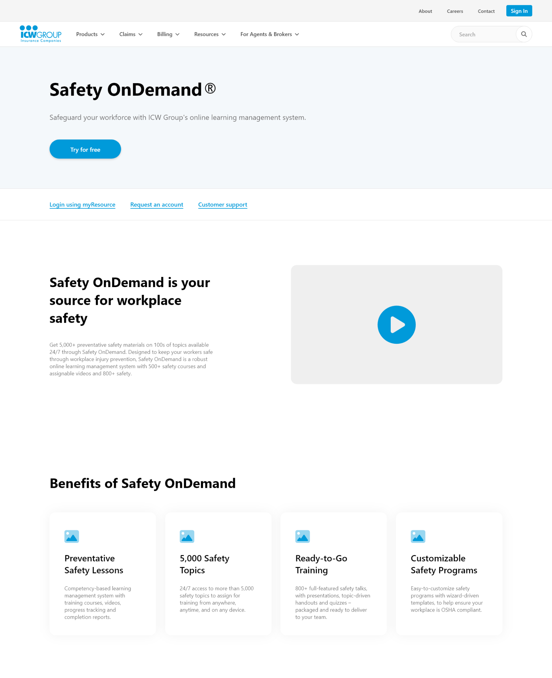
Persuasive Design
Using a well placed CTA that emphasizes the "Try for free" feature, I was able to encourage more users to sign up for a service.
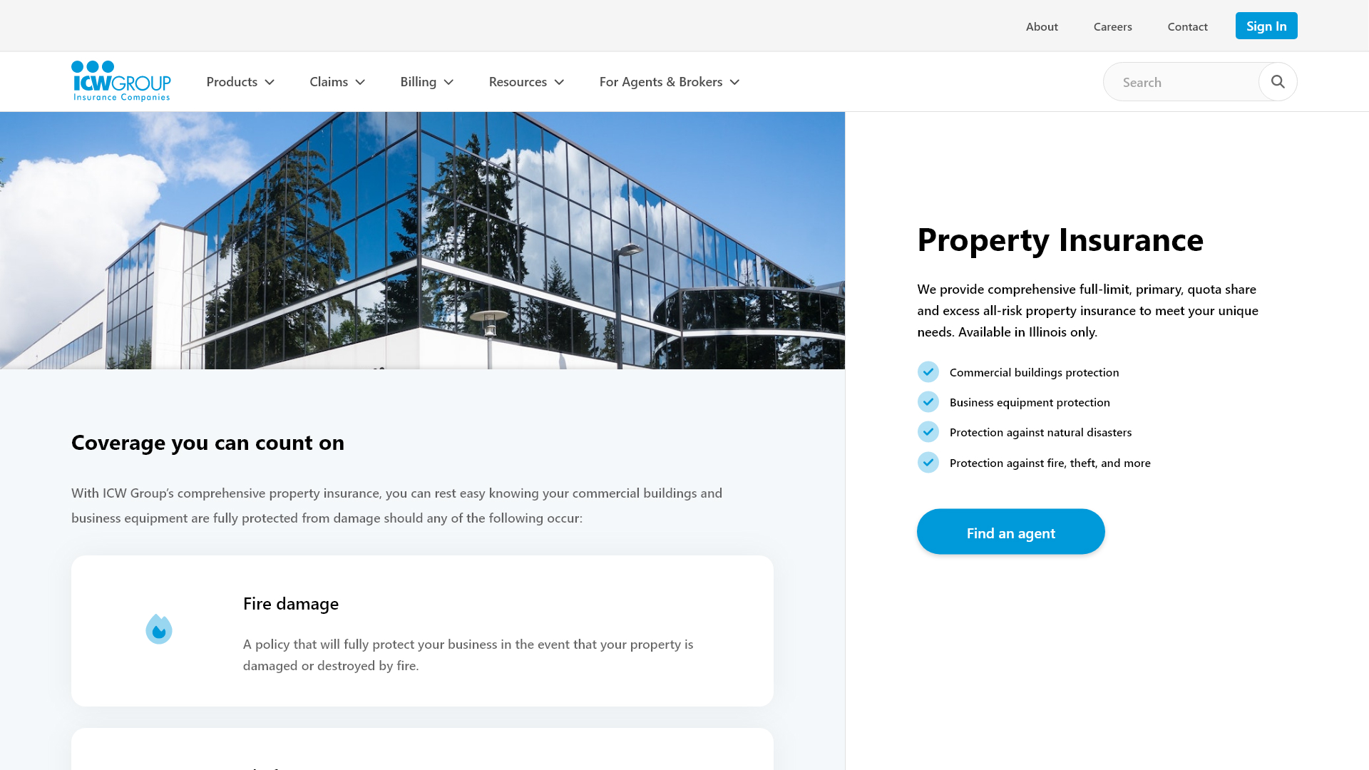
Funneling an Audience
The website aims to funnel prospective customers through a series of steps that converts them to "Find an agent". Product pages with this CTA leverage a familiar layout found on e-commerce websites.
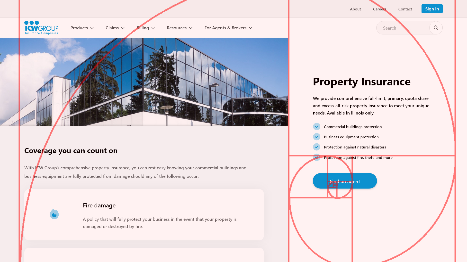
This is also an example of how I incorporated the golden ratio into my design to draw attention to the CTA.
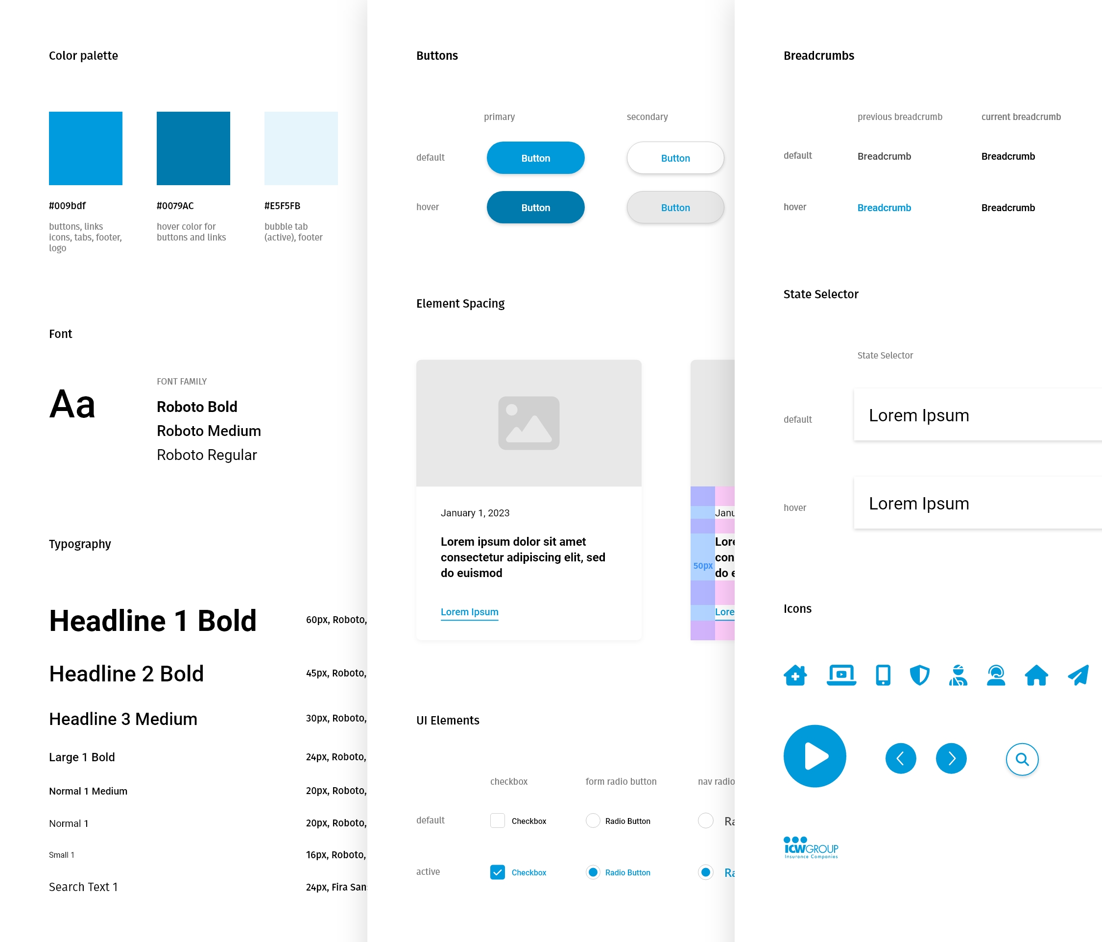
Style Guide
Components throughout the website's wireframes were designed and integrated for a consistent look and feel.
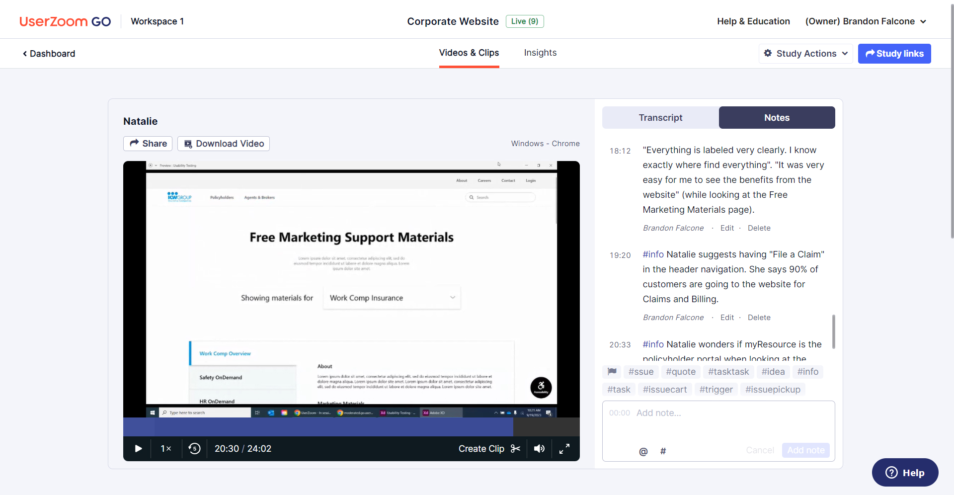
Usability Testing
I recruited 6 local participants that closely matched our 2 personas to take part in 1-hour usability testing sessions at the work environment. Filming and note-taking were captured using UserZoom.
Participants
6
User Tasks
43
Prototypes
2
Observations Recorded
100+
Usability Issues Fixed
17
Satisfaction Rating
9.8
Problem
In my sessions, I discovered that users weren't using the header navigation as often as I liked and struggled to find pages they were looking for. It did not give our primary persona a good experience to bucket all of their links under the nav item "Policyholders".
Solution
I removed the nav item, "Policyholders", and replaced it with "Products", "Billing", and "Claims" which were originally sub-categories. Now we had a more user-friendly nav that tested well with our primary persona, and did not negatively impact our secondary persona.

Brandon Falcone
UX Designer, Developer